
70-30 Rule in Interior Design: A Practical Guide for Kerala Homeowners
When creating a beautiful and functional home, it's not enough to simply choose furniture that looks good or colors that are in style. Interior design is also about finding balance, proportion, and harmony. The 70-30 rule is an example of a design technique that has stood the test of time. You may use this simple but powerful method to put graphic elements together in a way that is both cohesive and inviting.
The 70-30 rule might assist Kerala homeowners in making their homes both culturally relevant and stylish. This is because the architecture in this area combines modern amenities with traditional charm. This blog will explain the 70-30 rule, why it matters, and how to implement it correctly in your Kerala home. Let us discuss it here, read more..
What is a 70-30 Rule in Interior Design?
The 70-30 rule is a guideline that is used in interior design. It indicates that a room should have a style or color scheme that is 70% dominating and a 30% style or color scheme that is opposing or complementary. This not only allows for visual intrigue and personality, but it also produces a place that is balanced and harmonious.
70% Dominant Style/Color: This serves as the basis for the design of the room. It could be a particular style, such as modern, minimalist, or classic, or it could be a predominant color palette.
30% Contrasting Style/Color: This section provides features that either complement or contrast the prevailing style, providing visual appeal and individuality to the overall composition. Accent colors, a variety of textures, or standout objects are all examples of this.
Why is the 70-30 Rule Important in Interior Design?
When it comes to interior design, the 70-30 rule is crucial for striking a balance between form and function. This helps to create visually balanced and harmonious rooms. As the saying goes, "70% of a room is for its principal function and designated style," while the other 30% is for decorative items or opposing styles to inject character and interest.
Balance and Harmony: A sense of equilibrium is created as a result of the rule, which ensures that a dominant style or color scheme is balanced with components that are opposed to it.
Visual Interest: A space can be prevented from appearing repetitive by introducing a contrasting thirty percent, which allows for personal expression through the use of accessories, art, or a different style.
Functionality: The rule ensures that the space is functional and satisfies the requirements of the people who are occupying it by assigning seventy percent of the space to the principal function of the room.
Personalization: Personal taste and preferences can be incorporated into the area, giving it a one-of-a-kind vibe that is representative of the people who live there, thanks to the thirty percent.
Helps to Prevent Overwhelm: Maintaining a distinct dominating style is one of the ways that a 70-30 split helps to avoid a place from looking congested or disorganized.
Check out this blog on: Minimalism vs Maximalism: Which Interior Design Style Suits your Space?
Applying 70-30 Rule to your Kerala Home
When decorating a home in Kerala, it's important to choose color schemes that go well with the local architecture and way of life so that the space feels harmonious and attractive.
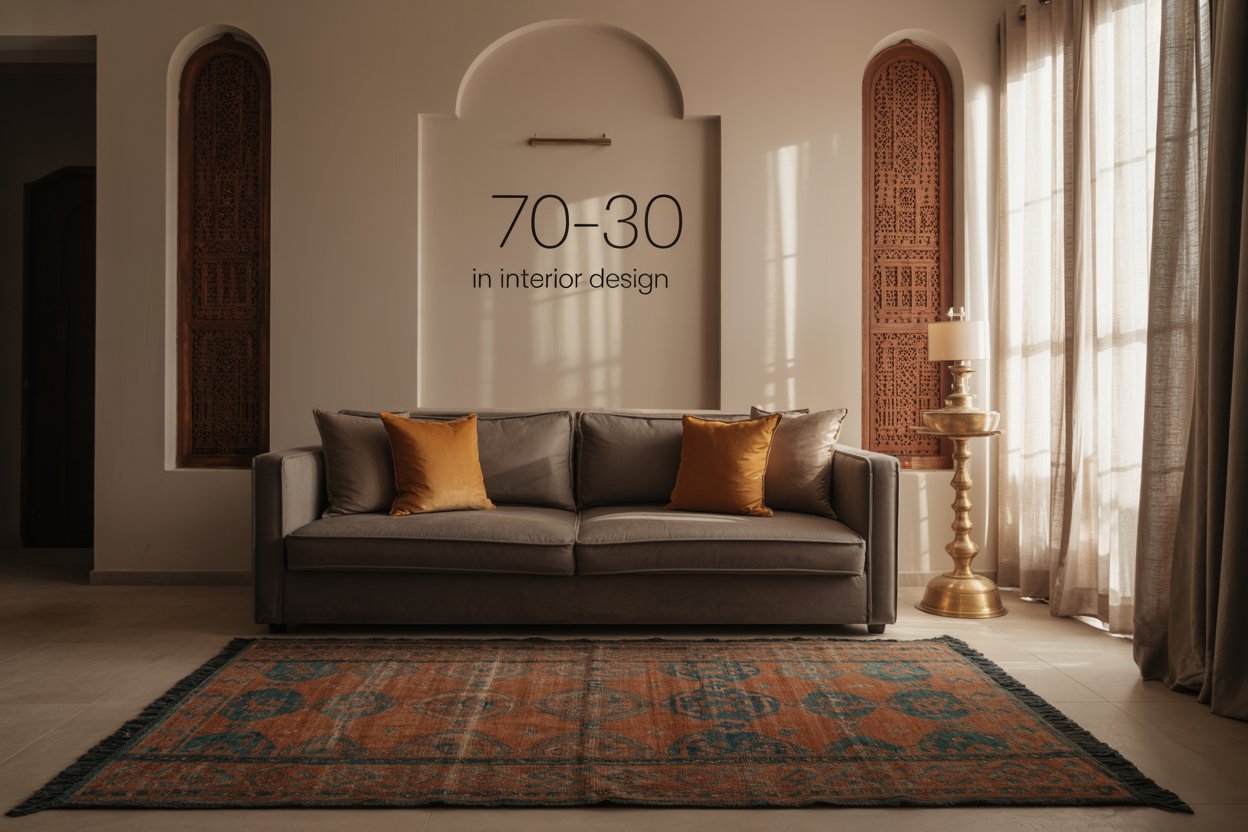
- Dominant Color (70%)
- Take the climate of Kerala into consideration. Kerala's warm and humid atmosphere frequently calls for colors that are cool and peaceful.
- The colors white, cream, beige, and light hues of green or blue are popular choices for flooring, large furniture pieces, and walls. White, cream, and beige are also wonderful choices for walls.
- These hues contribute to the creation of an impression of spaciousness and reflect sunlight, so reducing the temperature of the interiors.
- Accent Color (30%)
- Use accent colors to offer splashes of vibrancy and reflect your style. This will both introduce warmth and personality into the space.
- Using hues such as ochre, terracotta, rich greens, or even typical Kerala mural colors for pillows, curtains, artwork, and smaller décor pieces is a great way to create an accent that is inspired by Kerala.
- It is important to create visual interest by contrasting the dominant hue with the accent colors, but it is also important to blend the accent colors seamlessly in order to preserve a unified appearance.
Color Scheme Examples
Monochromatic: To achieve a calming and organic effect, use a variety of green hues (predominant 70%) with 20% yellow accents.
Cool and Calm: The walls can be white or cream with accents of blue or grey, making up 30% for a more contemporary and peaceful vibe.
Warm and Traditional: A warm and authentic Keralan vibe achieved with 70% beige walls and 30% terracotta and ochre accents.
Neutral Base with Bold Accents: Paint the walls a creamy tone (70%) and accent them with bright colors (30%) for a bold and contemporary style.
Just as colour psychology plays a vital role in enhancing productivity and mood in offices, it also influences the comfort and mood of your home. Check out this blog on: How Colour Psychology Can Transform your Office Productivity and Mood
Common Mistakes When Applying the Interior Design 70-30 Rule
- Jumping into a design without first settling on a space-specific idea or plan usually results in a jumbled and flawed final product.
- Introducing a variety of styles without establishing a clear hierarchy, leading to an overpowering and disorganised space. To keep things in check, the 70-30 rule suggests focusing on just one style at a time.
- Using low-contrast colors or materials can make a room seem lifeless and uninteresting.
- Making a small room feel too claustrophobic or overwhelming by selecting furnishings and decorations that are too large for the space.
- Using an excessive number of ornamental items can result in an overly chaotic and unpleasant environment.
- Paying no mind to the practicality of the area in favor of its visual appeal.
- Choosing a color scheme that clashes with the room's dimensions, function, or lighting.
The 70-30 rule is not just a design tool, but it can also help you make your home more stylish, comfortable, and unique. You may use this rule to make rooms that are "just right," whether you're mixing modern minimalism with Kerala's traditional style or neutrals with vibrant highlights. When making well-balanced and expressive interiors, Redwood Interiors follows the 70-30 rule to the letter.
Choosing colors, textures, and important furniture pieces that go well together is what a primary style is all about. This lets us build a strong base. The last 30% of the design adds dramatic accents, uncommon materials, and show-stopping standout pieces to make the contrast even stronger. Finding the right balance may help keep things interesting and make sure that every room is attractive, useful, and different from the inside out. The 70-30 rule is more than just a design rule for us. It's a terrific way to keep things exciting and in balance.
